Description
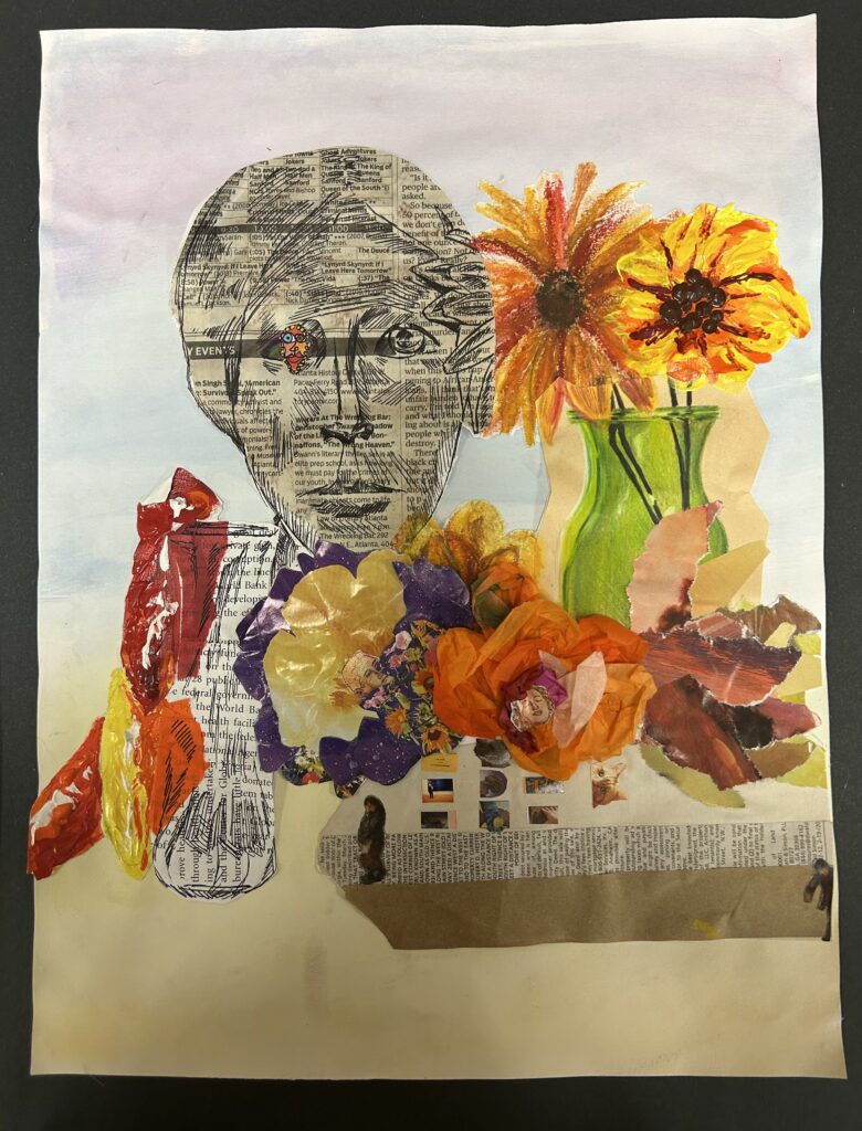
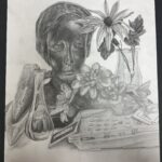
This collage piece titled “Stoned” along with the graphite artwork was the first project of first semester. This collage consists of various mediums along with with complimentary colors along side each other throughout. It has a triangular composition with a gradient background. Since the colors are complimentary to each other, it’s more easy on the eyes as well as a triangular composition making the piece more simple in a sense.
Analysis
The acrylic paint flower and peppers look a bit blotchy when compared to the other objects surrounding it. While the statue of the woman herself is supposed to be the focal point, it is hard to see her face and details because the ink used over the newspaper blends in too much. However, the flowers made from magazine pieces turned out nice because of the variety in pattern and shades of similar colors.
Interpretation
The theme for this piece was surrealism. The artist made this artwork with the intent on making things look a bit out of the ordinary, almost like an acid trip. This was achieved by using different mediums such as newspapers, magazine papers, watercolors, and more. If the viewer looks more closely at the piece, they can see little heads poking out from the flowers, and tiny people on the telephone.
Judgement
One of the strengths of this artwork is the use of color. Since many of the colors were complimentary, they mesh well together in the overall spectrum of the piece. Not too straining or too monochromatic. However, this collage has many weak points, one of them being spacing management. This artwork has a bit much negative space even when looking at it from afar. Another weakness of this art is the poor craftsmanship when using the different mediums together. The paper for the background is noticeably wrinkled due to the overuse of watercolor, and the viewer can notice the overall smudginess of the soft pastel flower when it’s not supposed to look like that.


